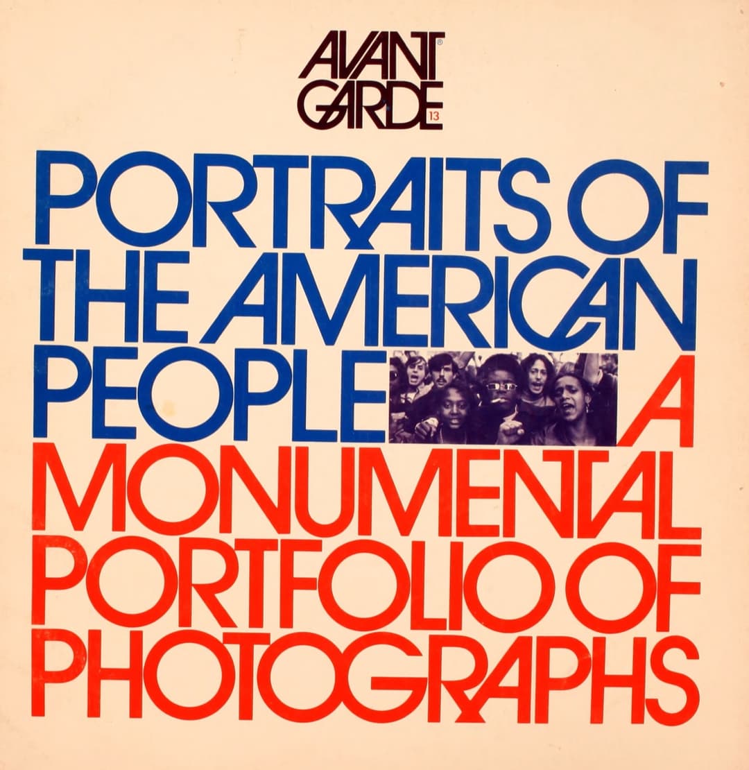
Type big enough becomes structure.
Avant Garde was Ralph Ginzburg’s magazine, published from 1968 to 1971, and Herb Lubalin was its art director. His logotype for it, capitals that lock together in tight ligatures, grew into a full typeface in 1970: ITC Avant Garde Gothic, drawn with Tom Carnase.
On the cover of No. 13 the type is the layout. Six lines of capitals run from margin to margin, set so tightly that they read as one block, and the lower three are printed in red. The red lines on the plate are the baselines of that type, measured from the cover itself.
Swiss designers usually started from a grid and fitted the type into it. Lubalin often worked the other way round: the letters set the measure and the page followed. Set large enough, a word stops being text and becomes a shape.
- Let the size of the type decide the size of the grid.
- Letterforms have geometry. Use their widths and heights to set columns and rows.
- Treat typography and layout as one decision.