One grid, every decision.
Otl Aicher led the design of the 1972 Munich Olympics: the colours, the typeface, the signs, the posters and the pictograms. The palette was light and cool, led by a pale blue, and everything was set in Univers. It remains one of the most complete design systems ever made for a single event.
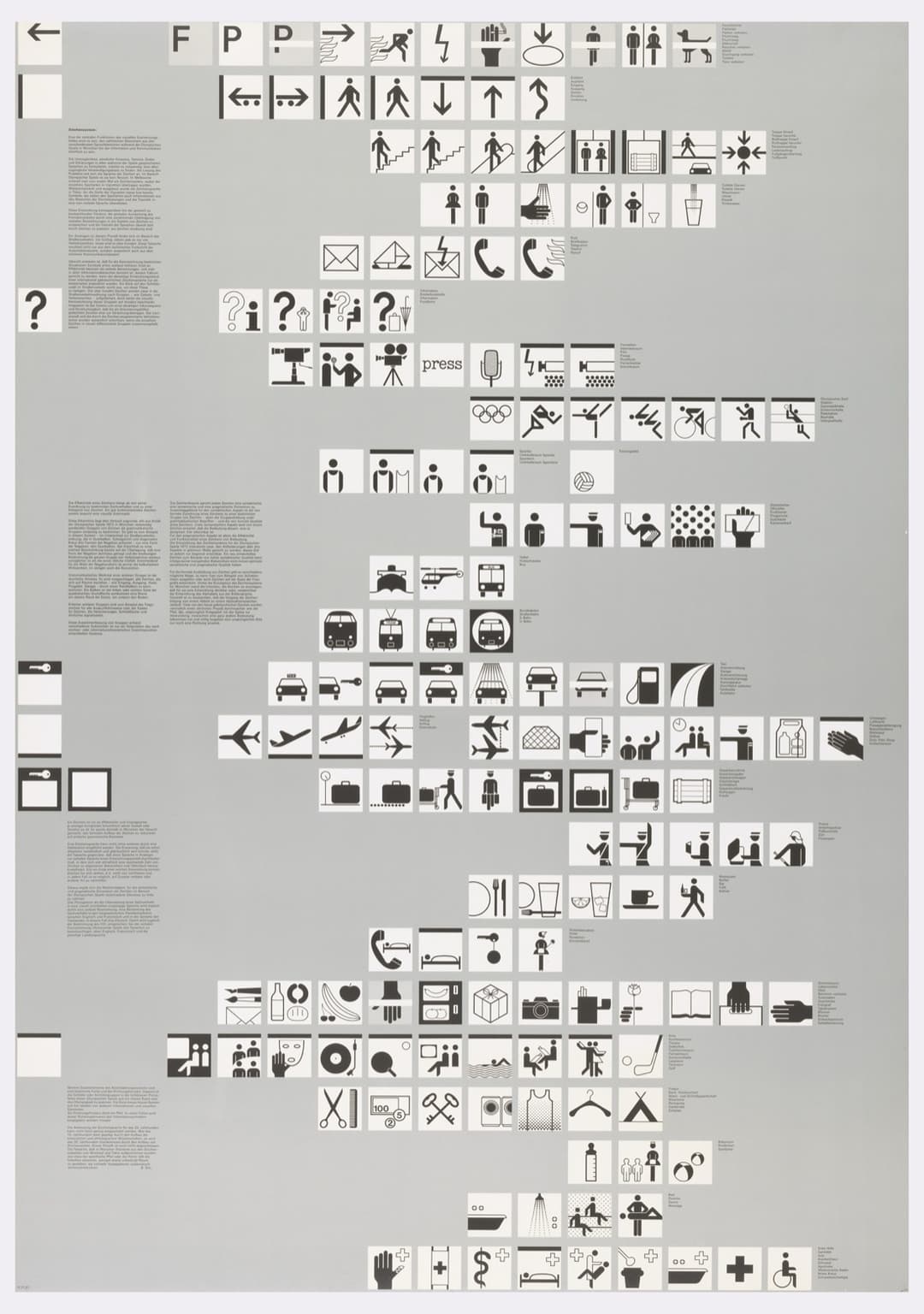
The pictograms were drawn on a square grid with lines at 90 and 45 degrees, so every arm, leg and ball follows the same few angles. This sheet shows them as a set, each in its own square of the module field. The red diagonals on the plate stand for that 45-degree construction.
The grid did more than arrange pages. It generated a visual language that held together at every scale, from a sign in the stadium to a pictogram in a printed programme. Later research has found small inconsistencies in its geometry, but the system still speaks with one voice.
- Apply one grid at every level, from layout to icon to type, and the parts will belong together.
- A design system is a grid with its rules written down.
- Reduce until only what carries meaning is left.