The less that remains, the stronger it speaks.
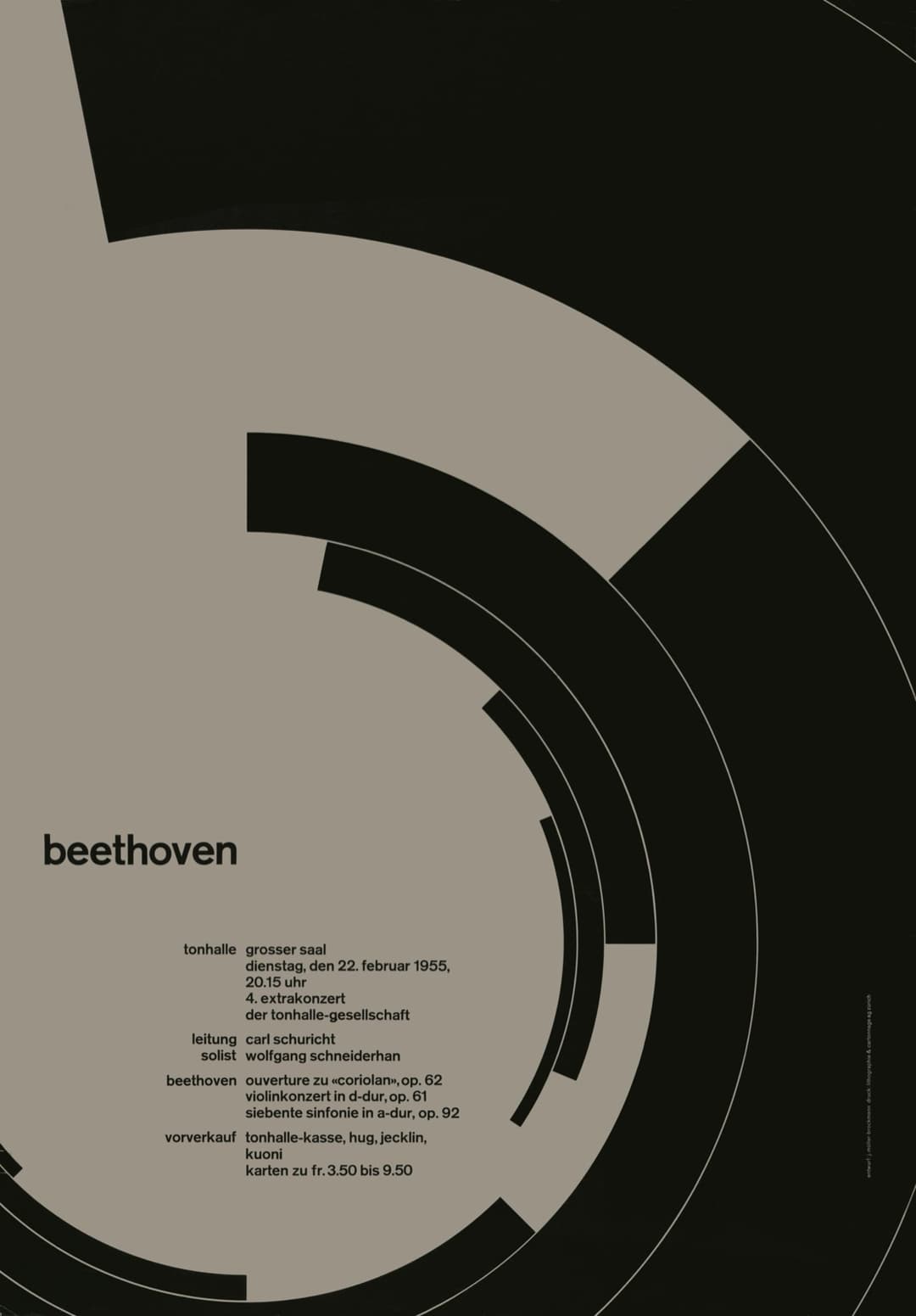
From 1951, Josef Müller-Brockmann designed the concert posters for the Tonhalle in Zurich. This one announced a Beethoven evening on 22 February 1955: black arcs on a warm grey ground, the title in lower-case letters, and almost nothing else.
The arcs are segments of rings that share one centre, growing shorter and thinner as they close in on it. The red rings on the plate are measured from their printed edges. All the type sits in the lower left, the programme set as a small table, with labels ranged right against the details ranged left.
Twenty-six years later Müller-Brockmann set out the method in a book, Rastersysteme für die visuelle Gestaltung (Grid Systems in Graphic Design), and this site takes its address from that title. The poster shows the method before the book did: decide the structure first, then let very little happen inside it.
- Let one form dominate and let everything else support it.
- Keep the type together in one zone of the grid.
- Decide the structure first. Then add as little as possible.